Building Effective Dashboards within a Procurement Context

The procurement profession has rapidly shifted toward data-driven decision-making, with the visibility provided by dynamic dashboards an invaluable lifeline for those who drive their organizations forward.
The environment is inundated with data and difficult-to-navigate or non-user-friendly proprietary visualization tools, making it seem like a monumental task to build effective dashboards. The biggest question often is: “Where do we start?”
Here are the fundamentals.
A Dashboard’s Elements
When building a dashboard, it is best to break it down into four main sections:
- The banner. This is the main header of the dashboard and gives a high-level overview of the data set you’re looking at.
- Spend divisions. These are used to further parse down the data set within the visualization. Are you interested in contracted spend? Diverse suppliers? Those are great examples to use within your spend division section.
- Decision-making. These charts are the main feature of a dashboard and drive the point of the dashboard.
- What’s next. What does the dashboard show? Here is a great opportunity to share recommendations on what to do moving forward.
The Banner

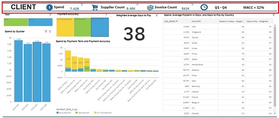
As the banner is where your audience is first introduced to your data set, use this space to give a general overview. For instance, the dashboard image above displays five main data points: spend, supplier count, invoice count, data set time frame and weighted average cost of capital (WACC).
Simply by looking at the data outlined in the banner, we can infer that this dashboard was created to show spend optimization. The use of widgets helps to make the banner more digestible for audiences as well and can be a key component to your banner.
Spend Divisions

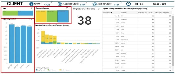
The spend division is where your audience can further parse through the data. In the above image, we use tree maps to distinguish between year and payment accuracy. A bar chart is also used to further differentiate time into quarters.
Pie charts can also be used for further filtering as they show clear and distinct sections within a category. Your audience can easily use these types of visualizations to filter to the data set it is interested in.
Decision-Making

The decision-making section is the main portion of your dashboard and uses charts to better visualize your data. Above, the stacked bar chart is used to show the spend by payment term, which is colored by payment accuracy. This gives the audience a clear and succinct way of knowing which payment term is associated with the most spend and where there might be risk from late payments.
In business intelligence visualization tools, these graphs will automatically update based on filters that have been applied. So, if you were to filter for the first quarter of 2019, the chart would update to reflect spend from that quarter.
What’s Next
Whereas the past three sections have laid the groundwork to understand the data, the “what’s next” (or “so what?”) section gets to the point of the dashboard. All visualizations depicted in the dashboard should work towards answering this question.
The table on the right of a dashboard summarizes the main point of the dashboard, which is weighted average days to pay, and use the table on the right to further differentiate pay term in days and weighted days to pay by country. By highlighting this key metric, users can see this as a call to action and better negotiate pay terms for their suppliers.
Dashboard Fine-Tuning
In addition to knowing the fundamentals, it is equally important to discuss how to fine-tune your dashboard.
First, build to your audience. Crafting your dashboards to your intended audience is critical to the applicability of your visualizations. That audience likely includes three main end-user groups, each with core pressing needs that your dashboard should be built to support:
- This group needs to understand spend across client environments to answer procurement questions and support procurement tasks.
- Category managers, who need to view opportunities through visualizations capable of supporting slice-and-dice functionality for natural opportunity hunting exploration down to the line-item level.
- Executive team, which needs summarized metrics that matter. These are visualizations centered around impact to the business with what-if analysis to enable organizational decision-making to support strategic initiatives.
Second, tell a story. The art of story-telling is not limited to motivational speakers — it is the key foundational aspect of making a dashboard relevant and purposeful. Reflect on the story behind your dashboard’s purpose, ensuring a one-line impact statement can be easily derived from each visualization you choose to place on your sought-after dashboard real estate. If the visualizations are not adding value to your dashboard’s story through clear, ingestible and compelling data, then consider a new visualization or data point.
Finally, act or advance to the next step. The dashboard and visualizations must leverage underlying data to quickly enable the end user to mine “insights” that will lead to an end action or a next step to drive value for the organization. The insight mined from your dashboard should be easily recognizable and should communicate a meaningful pattern, trend or relationship supporting the story line your dashboard was curated to showcase.
Other fine-tuning considerations include: (1) read left to right from high level summary visualizations to lowest level of detail tables, (2) minimize white space, (3) evaluate filtering and customization capability needs for your intended audience, (4) determine data extraction capability needs, (5) assess data refresh cadence requirements and (6) control your dashboard through appropriate user permissions and access levels.
Building an effective dashboard — with proper fundamentals as well as fine tuning to support decision-making for end users — requires a complex skill set. But with the right preparation, guidelines and practice, practitioners can create dashboards that drive their organizations forward.

